Fear Special - for Halloween, get it? Yeah, over a month ago, even I hardly care.
From the bookstore again, I got the Cover "A", Mercy by David Stoupakis, a woman in robes holds a dying demon, resembling a familiar sculpture (Pieta perhaps?). Kinda murky, I'll give it a 5. The other covers are shown in an ad on the last page, these are pretty dark too.
Mr. Morrison's editorial has sketches by Rantz Hoseley, and he has a go at a Lovecrafty-ish style, squeezing out inner dread like the last of the toothpaste. Impressed that he can produce these prodigious screeds, but really, how long does he think he can keep this up?
Das Fischerhaus by Deric Hughes, Benjamin Raab, Mike "feeb" May, Rantz Hoseley - 6 - (miscredited as Der Fischerhaus on the contents page) Mr Hoseley is credited as Editor here, perhaps some pages were excised for brevity. Wordless, a couple nice artistic touches, and the visual metaphor of an anglerfish was cool, besides that perhaps not too original and rather tame.
Gallery with David Stoupakis - 6 - Some nice ability and technique are displayed, most are pretty dark much like the Cover "A".
Nightfeed by Juan Roldan and Patricio Delpeche - 4 - A young parent wakes to a crying baby. It's a little clever but only slightly funny.
The Smile of the Absent Cat by Grant Morrison and Gerhard - 6 - A noir-ish detective story, told in a world of cats. The detective takes the assignment to find a big-shot's wayward daughter, and in to the gritty underworld he goes. Somewhat interesting so far, it's to be continued, this Chapter One is subtitled "the origin of nothing".
Gallery with Morpheus Fine Art - 6 - A Giger and a few other nice images.
Constriction by Daniel Govar and Mike Walton - 6 - A woman's sudden and unexplained illness destroys the world, or something like that. The premise and resolution of the story are quick and it sort of grabs you, but I found myself wanting more out of such a dramatic scene.
Semiautomagic - the hollow man by Alex de Campi and Jerry Ordway and Louise - 6 - A celebrity of some sort is called out for his possession by tiny demons. There's a clever bit here and there, but for me, the quite serviceable art and storytelling didn't do much to impress. The tiny censorship of a line was the most intriguing part. It appears this is a series of some sort, though I doubt much more will appear in the mag. I could be wrong though...
Gallery - Tim Lehi - 6 - Interview by Frank Forte. Tattoo and other art. Not my thing but good for him.
Holiday Offering by Diego Agrimbau and Gabriel Ippoliti - 6 - A mob hit is interrupted by the radio broadcast of War of the Worlds. There's nothing wrong with this one, it's done nicely enough, but I just didn't get excited about it.
Zentropa by John Mahoney - 8 - I'm enjoying this a good deal. I enjoy the detail I get to scrutinize, and that it's sometimes rewarded. Seeing it's computer imagery, I enjoy imagining the playing around generating and arranging and accessorizing the models to make the images, and wondering about levels of intent in the content and composition. It's funny how this kind of obtuse storytelling can inspire imagination for me. And there's more splooges and spliffs and bits and splashes.
Gallery by Justin Cherry - 7 - It's the fourth Gallery in this issue, with an interview by Rantz Hoseley. Some intriguing and compelling images. The artist tells us some things about himself, including tumblr and artstation addresses with a unique moniker, which is not matched by an email address noted elsewhere in the Gallery (a couple extra i's), which made me wonder if it's a typo or on purpose. I looked a little further and saw some more of his cool stuff, and it appears to be on purpose. What a guy.
Salsa Invertebraxa by Mozchops - 7 - Part Four it says, it's pretty cool. It starts with a repeat of the last couple pages from the last installment, that kind of overlap is kind of unique. The action takes us to the lows and the highs of the forest environment, it's pretty dark below but considerably brighter above. In the depths our plucky heroes try to pluck some prey, by pouring little sharp looking bits on their victim, causing a distraction, if not its demise. I wonder if that's supposed to be diatomaceous earth, or is there something else that's toxic to insects in that way too. I wonder if this is really to be continued, I kinda hope so.
Felt by Tom Burns, Maxx Marshall, Chris Chuckry - 5 - A girl has a special day at school. It looks rather interesting, in terms of the color and composition and rendering of the art, but I couldn't make much sense out of it. All the action and exposition went nowhere for me. I suspect it's part of a continuing story we will probably never see again.
Gutt Ghost by Enzo Garza - 6 - A grouchy ghost consumes a random shithead. I happened to like the art style, and the joke was kind of clever. I bet this one is part of a regular comic that we will also likely not see in HM again. A few of those this issue.
Monday, December 19, 2016
Sunday, December 11, 2016
Eyebrow Tuna
So I looked and saw that the Eyebrow Tuna videos are still up on youtube:
HM youtube
These are from about 8 years ago, I don't think they ever got a mention in the mag (I could be wrong, it's possible I forget it in one of Mr Eastman's sporadic editorials, maybe I'll look someday) but they were linked on the old HM website metaltv.com, which is still referenced on the youtube (but which now directs to the current HM website).
There was some story about Mr Eastman and Simon Bisely making a drunken trip to Japan, where they saw these animated kid shows and thought it would be funny to do profane voiceovers. A Paul Jenkins was responsible for actually making them. They're perhaps not too HM, besides being what Mr Eastman thought was funny. They can be funny sometimes, in a crude and stupid way. More funny to me is that they are still out there. I wonder if Mr Morrison knows about this.
Monday, October 17, 2016
Heavy Metal #282
Cover "Taarna Returns" by Patrick Reilly - 7 - It's the "Cover A" from the bookstore, and it's the winner of HM's cover art contest. It's got several features of typical HM cover art, a babe, a monster, a sword, and it is more than just a pin-up. It also references the 1981 Heavy Metal movie's most famous segment. (I'll take this opportunity to note how Mr Morrison and also Jeremy Holt, the writer for the HM comic Skip to the End, have said in interviews that they had not seen the HM movie. This interests me since the HM movie presents a conflict in my mind about HM's cultural impact, in that the HM movie is often what HM means to a lot of people, while I thought when it came out that it missed much of the mag's ability to inspire imagination. And it was in the first (and best) five years of the mag's almost 40 year history. It's likely too much to expect for these two to have read every issue, and seen the movies and years of other crap, like a dork like me has, but for two current significant contributors to have not seen the movie is amusing to me.) I imagine the "classic" aspect of this entry won it the grand prize. Even though it's not too much a "sci-fi" cover for this Sci-Fi Special. There's also a feature inside about the cover contest, which has the other published covers and more of the entries.
I didn't see any new relatives' names listed on the contents page, but I did notice that the contents page art is credited (by Jakub Rozalski who also is featured in the Gallery) and mostly has been recently. I don't think that's always been the case, sometimes a signature could be seen but sometimes it was a guessing game.
The Editorial is a slightly amusing joke, written by a computer rather than Mr Morrison (can't fool me, I saw Mr Morrison credited on the contents page). A riff on 2001's Hal, it still manages to name staff and contributors and puff up the mag. What will he think of next?
Atomahawk by Donny Cates, Ian Bederman, Taylor Esposito - 7.5 - A "cyberzerker" scourges the earth, obeying his blade's thirst for death. While the art may be the least part of this feature, it sometimes looks like it's drawn with colored markers, it still has great composition and is very successful conveying brutal action and progressing the story. Similarly the writing sets a dramatic tone and mostly avoids being overwrought, and has a few clever bits. It says to be continued so I can look forward to more fun.
Gavrilo C-914 by Zeljko Pahek - 8 - (miscredited as "C-194" on the contents page) Extra points for the classic black and white style, and that Mr Pahek has been a HM contributor since 1989. Misadventures on a robot movie set. The black and white art is not what you'd call a clear line style, there are snips and bits all over the place, but I like it. It can feel quite gritty, and can fit quite well with a decrepit steam future with coal-fired robots, and it's been used well over the years in HM, not just by Mr Pahek.
Industria by Grant Morrison and Ran Hughes - 5 - subtitled "and the toilet that traveled through time". While I'm not too excited by another overly busy gang of stereotyped super spies presented in comic form, I did find a few of the jokes funny, and the art is colorful and nicely executed. It is kinda sci-fi too. I'm concerned we might be afflicted with more of this story, but it might just be another preview of a HM-published standalone comic, so I may be spared.
Zentropa by John Mahoney - 7 - my heavens, what a delightful, tripped-out mess. Good thing I'm easily amused by scrutinizing details and obtuse storytelling, else I'd get frustrated by the incoherence of it all. I might guess it's some sort of dream sequence, but I hope it doesn't end with a "and then I woke up". We'll get a chance to find out, maybe, since it's "to be comntinued..."
Gallery-Design by Jakub Rozalski - 6 - with an interview answering a few anonymous questions. The artist says it best, "The countryside, nineteenth century paintings, extraordinary giant machines, wild nature and animals". With an affection for two-or-more legged walking machines, smoking or not, there's some quite nice looking and imaginative work. Perhaps it doesn't demonstrate a wide range of subject matter, but it does what it does nicely.
America Owns the Moon by Craig Wilson - 6 - A moon colonization expedition doesn't go as planned, depending on whose plan you're talking about. It seems it's supposed to be an alternate future, with a reference to President Kennedy returning from Dallas. A fast paced sci-fi-ish story, and more stereotyped characters, though I was amused by "Mortimer Drumpf, bazillionaire son of the Drumpf dynasty..." which made me wonder how timely it was really supposed to be, and the "ex-football great turned-botantist" who made me think of Richard Branson for some reason (or maybe it's supposed to be Lebowski). The art is demonstrative if not evocative, it's got some funny bits, like the "stoned agin" poster and lava lites.
Julia and Roem by Bilal - 9.8 - My highest rating ever, and I'll admit to inflating it for sentimental reasons. As with the previous Animal'z, it's been a joy to have such wonderful work from Bilal, one of the titans of HM's history. I really did enjoy this story, I liked where it went with the Shakespeare references. I'm sure there were many I didn't even get. That it came up with a happy ending, because someone knew the script but didn't follow it, was actually fun. And I liked the art and often finding things I thought were quite lovely.
The Human Curse by Leonie O'Moore - 5 - A somewhat interesting premise, that the now-extinct humans were cursed and artifacts from their era carry the curse, even though no one knows what the artifacts were meant for. I'm afraid the story didn't do enough to convince me of the believability of the premise, and the art had some nice aspects but was otherwise unable to advance the story.
Gallery-Art, the Threadless Heavy Metal Cover Art Contest - 7 - Featuring the winners and several other entries in the cover art contest. A broad range of styles and subject matter is displayed in the couple dozen entries shown. I liked most of them in one way or another. They all have strong points, and not many have weaknesses, but I don't want to single any out one way or the other. I did note the relative lack of cheesecake styled pinups, which I would think would be more predominant if this contest was held a few years ago.
Genres by Diego Agrimbau and Pietro - 6 - a comic about comic artists as the subject of a comic by otherworldly comic artists. Clever if perhaps not too deep. The art and storytelling are ok, I liked the premise and how it was presented even more.
City Beneath the Waves by Dwayne Harris - 6 - Future undersea explorers have their Charleton Heston "Damn you, damn you all to hell!" moment, or maybe it's their "I H8 NY" moment. (miscredited as "City Under the Waves" in the contents page).
Interceptor preview - 5 - Looks ok, a promo for a HM trade paperback by Donny Cates and Dylan Burnett. This might have been an ok teen titans vs. alien vampire story if it was in the mag, but it's just another comic I won't seek out.
Slow Dancer by Bill Sienkiewicz - 8 - subtitled "Or: Movements Calculated to Drive You Lonely - Or Worse". Noted "1983", which would indicate this was not digital, and it shows, it looks done by hand, (the second page has three images of "the doc" from the same perspective and pose, but they are not just copies), not like most of what you see in the mag lately, though the robot editorial said it was "newly remastered" so I can't be sure. I thought I recognized Mr Sienkiewicz's name, but I was surprised to only find two entries when searching the HM web site cover gallery. I had thought he was a more frequent contributor. The internet told me he is a well-known comic guy, and that this was his first writing effort, and it appeared in Epic in 1986. The story is likewise anachronistic, more moody and subtle than wailing its pain, one man's struggle, and loss, against the conniving power structure. It made me think about how things were 30 years ago.
Salsa Invertebraxa by Mozchops - 7 - Part Three it says. This one really came out of the shadows, with page after page of lavish colors and neuron-fusing depiction of insect life. I am more impressed by the attention to detail, that makes me think these are images of actual insects, instead of from a vivid imagination. I think I figured out that the protagonist is the guy with the long ear-like appendages. On the last page it even looks like it gets a facial expression. It would be interesting to know what kind of insect it is. I still am having a hard time following this, maybe I'm trying too hard. The hipster poetry narration isn't helping. There's supposed to be six of these if I recall, so maybe I'll have a chance to figure it out.
The Key by Grant Morrison and Rian Hughes - 6 - It starts with jackbooted thugs throwing someone in the river, then we see crowds with locks around their necks, in city canyons with what looks like propaganda videos on the walls, so I get the impression it's showing a modern conformist oppressive society. It seems to continue with a cry for individualism rising in the crowd, shown by the contrast of the identical lock collars and key images in the propaganda, with the ornate antique keys that actually unlock the collars. The art looks good and nicely done, with hard edges and subdued colors setting a harsh and rigid scene, but without dialog, I was not sure how well I put the images together to make the story. I'm pretty sure I'm missing something. The most enjoyment I got from this, was in contrasting it with the previous "Slow Dancer", which had a similar theme in my mind, but approached its story and presentation in very different ways. To me, having these in the same issue presented an opportunity to consider some of the ways that things have changed in the times between when these two stories were produced, in HM, and in my life.
The back cover is a riff on Taarna, with a woman wearing a t-shirt with the Cover A contest winner image on it, flailing her hair and perhaps her sword. While she's wearing a t-shirt and not the incredibly unlikely Taarna outfit, and it looks like a katana rather than a broadsword, I enjoyed how it evoked and displayed the cover image without trying to duplicate it.
Sunday, October 2, 2016
Spam?
My apologies to anyone misdirected here by a spam link. I see traffic from links all around the world that end in dkmhab dot xyz, which appears to be a fake "wanna see my sexy pics?" site. Please be assured the experts at fred's hm fan blog are doing everything they can to eradicate this. Again, my apologies.
to the spam bots and their operators, as soon as you can, please fuck off. it's very simple, all ya gotta do is fuck right off. thank you
to the spam bots and their operators, as soon as you can, please fuck off. it's very simple, all ya gotta do is fuck right off. thank you
Wednesday, August 31, 2016
Heavy Metal #281
Sex Special. Breaking with past tradition, this Special is named appropriately.
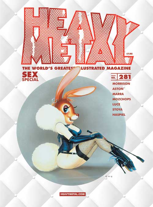
Cover - 5 - The Bunny Girl cover by Chris Achilleos was in the bookstore. I wish I liked it more, since Mr Achilleos also did the iconic Heavy Metal Movie Taarna poster, used for the cover of the September 1981 issue:

(unless I'm wrong and it's a different Chris Achilleos)
I just found the puffy-and-leather getup silly, and the cartoony depiction uninteresting, and the crosshatched treatment of the HM logo that's maybe supposed to look like torn fishnet stockings, but it doesn't, annoying. At least Mr Achilleos did a better job contouring the fishnets on the bunny girl's legs. And it's dated '99, so it's nice of HM to bring this well-aged work into the 21st century.
It occurs to me that the multiple covers might be an issue for the HM website cover gallery, though for #277 they only show the one "Cover - A" by Royo, and credit the "Cover - B" by Skinner without showing an image. So I will wonder how they will decide which cover they will have on the listing, assuming they maintain the cover gallery (which I hope they do).
I liked the inside front cover, by Philippe Caza dated '83, a great deal more.
The staff credits grew more, now including Kristan Morrison as Coordinating Editor. Maybe Mr Morrison will find jobs for his cousins too.
Mr Morrison mocks my disbelief by producing an only-slightly-less-wordy editorial for this issue, reinforcing an ambitious precedent. If we really get an imaginatively wordcrafted rant every issue, it will be fun. The picture has some pretty neat effects too.
Option 3 by Grant Morrison, Simeon Ashton, Adam Wollet - 6 - An imprisoned space stud is offered release in return for fucking in the service of the Firmament. It's enjoyably silly and sometimes clever and often nice to look at. I found myself wanting more from this than I felt I got. I think I managed to have elevated expectations when I gained a bit more insight from taking in some of the details in the art and storytelling, but then wasn't able to raise my impression of the whole of the story much higher than the first.
Luv U by Edgar Roggenbau and Patricio Delpeche - 4 - A somewhat modernized telling of the boy-and-his-sexbot story. There's a couple nice artistic touches, but I liked this one less the more I thought about it. I sort of get the desire for different sexual experiences, but the implications of crass objectification grew more annoying as I considered this one.
The Last Romantic Antihero by Dean Haspiel - 7 - An anti-apocalyptic love story, lovers fight the power over the years. This had much more emotional depth than the preceding, and I liked some of the artistic and storytelling techniques, such as different color themes for different time periods. I liked the story, and I even liked getting confused at the end (Amgod, wait, Billy Amgod?).
Frog Wife by Heshka - 7 - A funny and weird one-pager, a day in the life of the frog wife everyone wants to be.
The 49th Key by Erika Lewis, J.K. Woodward, Andworld Design (?) - 4 - Thank Heavens, it's the last installment. The second best thing about this one, besides being the last entry, is that in the first panel it looks like the guy's fly is open. I really had a hard time finding something to like in this story. The good news is, if it ever does become a movie, chances are good it will be better than this comic.
Her First Time by Jamaica Dyer - 7 - This starts as just another lesbian space lover story with unrefined art, but I thought it ended up very successful as it pursued its depiction of their passion fueling interstellar rule. Some of the line art with watercolor images are quite fantastical.
Zentropa by John Mahoney - 7 - Noted as "A wordless comic", it is that and more. Terrificly detailed drawing of undiscernable features, and maybe a hint of a sequential story being told. I simultaneously enjoyed and felt frustration with this one, it was fun exploring the sometimes suggestive detail, and odd not being sure of what I found (is that a .... nearing a .... or ?). This is noted as Part 1 and ends with a "To be continued..." so I'll look forward to where, if anywhere, this one goes.
Art Gallery by Corey Helford - 6 - a promo for an art gallery in LA. Some interesting images.
Julia & Roem by Enki Bilal, letters by Adam Wollet - 7 - Perhaps because it's sort of trying to tell a sort of coherent story now, I'm a bit less awestruck by this lovely depiction of Mr Bilal's talent, than I have been for previous installments. But just a bit.
One Such Partner by Stoya and Dean Haspiel - 5 - A short story of a bad girl's first love. With some nicely crafted and sometimes explicit dialog, and colorful and lively art, this was mostly likable. But I got rather annoyed when the last word is a quoted "just", but "just" appears nowhere else in the story (I think I know where it would go, but still).
Artist's Studio: Matthew Bone - 7 - with an interview by Frank Forte. Also with a title: Aphrodesia of the Explicitly Bizarre. Some very nicely, sometimes amazingly, photo-realistic paintings. There's boobs, so it fits in the Sex issue. There's also actual artistic expression, which I am less qualified to evaluate. But they do look cool.
Space Jizz by Ed Luce - 6 - A space explorer gets totally fucked. So it fits in the Sex issue. It's silly and crude but it has a lot of fun. It appears to suffer from some unfortunate censorship, it's too bad they think this is necessary.
Beachhead by Grant Morrison, Benjamin Marra, Tom Forget, Adam Wollet - 5 - The second of this two-parter with Mr Morrison, this keeps trying to have fun with the bloodthirsty alien conqueror thing.
Salsa Invertebraxa by Mozchops - 6 - the bright and colorful pages are nice to look at, when this finally emerges from the shadows, but the "story" lost me already. With four more parts to go, maybe it will pick things back up somehow.
Red Beaver Bandit by Heshka - 6 - an interesting oval "cameo" panel, showing a nearly naked redhead babe with a mask and bag, and a red beaver, exiting a window, with a red beaver. A bit of a pun, and I enjoyed it.
A handful of ads follow, including one for The Aftermath: Big Clean by the Molen brothers, which was in the mag for a few installments, but disappeared before completion. There's also a couple page preview of Heathen by Natasha Alterici. The most likely way I'll ever get these is if I come across any in a resale shop in the future.

Cover - 5 - The Bunny Girl cover by Chris Achilleos was in the bookstore. I wish I liked it more, since Mr Achilleos also did the iconic Heavy Metal Movie Taarna poster, used for the cover of the September 1981 issue:
(unless I'm wrong and it's a different Chris Achilleos)
I just found the puffy-and-leather getup silly, and the cartoony depiction uninteresting, and the crosshatched treatment of the HM logo that's maybe supposed to look like torn fishnet stockings, but it doesn't, annoying. At least Mr Achilleos did a better job contouring the fishnets on the bunny girl's legs. And it's dated '99, so it's nice of HM to bring this well-aged work into the 21st century.
It occurs to me that the multiple covers might be an issue for the HM website cover gallery, though for #277 they only show the one "Cover - A" by Royo, and credit the "Cover - B" by Skinner without showing an image. So I will wonder how they will decide which cover they will have on the listing, assuming they maintain the cover gallery (which I hope they do).
I liked the inside front cover, by Philippe Caza dated '83, a great deal more.
The staff credits grew more, now including Kristan Morrison as Coordinating Editor. Maybe Mr Morrison will find jobs for his cousins too.
Mr Morrison mocks my disbelief by producing an only-slightly-less-wordy editorial for this issue, reinforcing an ambitious precedent. If we really get an imaginatively wordcrafted rant every issue, it will be fun. The picture has some pretty neat effects too.
Option 3 by Grant Morrison, Simeon Ashton, Adam Wollet - 6 - An imprisoned space stud is offered release in return for fucking in the service of the Firmament. It's enjoyably silly and sometimes clever and often nice to look at. I found myself wanting more from this than I felt I got. I think I managed to have elevated expectations when I gained a bit more insight from taking in some of the details in the art and storytelling, but then wasn't able to raise my impression of the whole of the story much higher than the first.
Luv U by Edgar Roggenbau and Patricio Delpeche - 4 - A somewhat modernized telling of the boy-and-his-sexbot story. There's a couple nice artistic touches, but I liked this one less the more I thought about it. I sort of get the desire for different sexual experiences, but the implications of crass objectification grew more annoying as I considered this one.
The Last Romantic Antihero by Dean Haspiel - 7 - An anti-apocalyptic love story, lovers fight the power over the years. This had much more emotional depth than the preceding, and I liked some of the artistic and storytelling techniques, such as different color themes for different time periods. I liked the story, and I even liked getting confused at the end (Amgod, wait, Billy Amgod?).
Frog Wife by Heshka - 7 - A funny and weird one-pager, a day in the life of the frog wife everyone wants to be.
The 49th Key by Erika Lewis, J.K. Woodward, Andworld Design (?) - 4 - Thank Heavens, it's the last installment. The second best thing about this one, besides being the last entry, is that in the first panel it looks like the guy's fly is open. I really had a hard time finding something to like in this story. The good news is, if it ever does become a movie, chances are good it will be better than this comic.
Her First Time by Jamaica Dyer - 7 - This starts as just another lesbian space lover story with unrefined art, but I thought it ended up very successful as it pursued its depiction of their passion fueling interstellar rule. Some of the line art with watercolor images are quite fantastical.
Zentropa by John Mahoney - 7 - Noted as "A wordless comic", it is that and more. Terrificly detailed drawing of undiscernable features, and maybe a hint of a sequential story being told. I simultaneously enjoyed and felt frustration with this one, it was fun exploring the sometimes suggestive detail, and odd not being sure of what I found (is that a .... nearing a .... or ?). This is noted as Part 1 and ends with a "To be continued..." so I'll look forward to where, if anywhere, this one goes.
Art Gallery by Corey Helford - 6 - a promo for an art gallery in LA. Some interesting images.
Julia & Roem by Enki Bilal, letters by Adam Wollet - 7 - Perhaps because it's sort of trying to tell a sort of coherent story now, I'm a bit less awestruck by this lovely depiction of Mr Bilal's talent, than I have been for previous installments. But just a bit.
One Such Partner by Stoya and Dean Haspiel - 5 - A short story of a bad girl's first love. With some nicely crafted and sometimes explicit dialog, and colorful and lively art, this was mostly likable. But I got rather annoyed when the last word is a quoted "just", but "just" appears nowhere else in the story (I think I know where it would go, but still).
Artist's Studio: Matthew Bone - 7 - with an interview by Frank Forte. Also with a title: Aphrodesia of the Explicitly Bizarre. Some very nicely, sometimes amazingly, photo-realistic paintings. There's boobs, so it fits in the Sex issue. There's also actual artistic expression, which I am less qualified to evaluate. But they do look cool.
Space Jizz by Ed Luce - 6 - A space explorer gets totally fucked. So it fits in the Sex issue. It's silly and crude but it has a lot of fun. It appears to suffer from some unfortunate censorship, it's too bad they think this is necessary.
Beachhead by Grant Morrison, Benjamin Marra, Tom Forget, Adam Wollet - 5 - The second of this two-parter with Mr Morrison, this keeps trying to have fun with the bloodthirsty alien conqueror thing.
Salsa Invertebraxa by Mozchops - 6 - the bright and colorful pages are nice to look at, when this finally emerges from the shadows, but the "story" lost me already. With four more parts to go, maybe it will pick things back up somehow.
Red Beaver Bandit by Heshka - 6 - an interesting oval "cameo" panel, showing a nearly naked redhead babe with a mask and bag, and a red beaver, exiting a window, with a red beaver. A bit of a pun, and I enjoyed it.
A handful of ads follow, including one for The Aftermath: Big Clean by the Molen brothers, which was in the mag for a few installments, but disappeared before completion. There's also a couple page preview of Heathen by Natasha Alterici. The most likely way I'll ever get these is if I come across any in a resale shop in the future.
Thursday, August 11, 2016
The Dragon's Dream World
XTIN - The Dragon's Dream World, was a webcomic a couple years back, by Jeremy Ray. I first saw it from posts on the departed HM website forums, several years ago, and was taken by the dramatic black-and-white art and terrific fantasy. The story contained some otherworldly S&M that could be quite disturbing. The webcomic seemed to be rather spontaneously created, so some twists and turns in the story and creation occurred. It had some moderate success, and I even donated a bit, and ended up with a .pdf.
Mr Ray seems hungry for success, and has tried several things since, and recently tried a sequel (prequel?) to XTIN called Reincarrion: www.theduckwebcomics.com/XTIN/. I was quite amused that my puny blog was quoted in a promo video: JR XTIN
But he can also seem impatient, and has recently shifted to a reworking of The Dragon's Dream World. I think this is a good thing, since I think some unevenness could be smoothed out for better storytelling and story. Another .pdf is promised, and I hope it's followed through to completion. Also sprinkled in the posts are some promos and rants, so there's some other fun to be had, and other opportunities to support Mr Ray's quest for success.
So it's worth checking out and seeing how it progresses, and here's hoping for Mr Ray's success.
Sunday, June 26, 2016
Heavy Metal # 280
And so it begins....
The first issue with Grant Morrison credited as Editor-in-Chief. Kevin Eastman is still noted as Publisher. Frank Forte and R.G. Llarena, as well as Rantz Hoseley and Michael Moreci, are listed as Content Editors. So some names familar to me as a Heavy Metal reader, and some new.
Again I get the newstand cover. The cover image itself is eye-catching and colorful. Nubiles in worshipful positions around a baby diety, with a lot of teeth. Babe-i-tude is dialed down. Grant Morrison's name. The same "The World's Greatest Illustrated Magazine tagline. Rating? 7 - it looks cool.
Immediately noticable is a heavier stock cover, and a binding that solidifies an entire quarter inch on the edge. Which immediately causes a visible crease upon opening. Immediately showing that the issue has actually been read. I'm not sure how much I like this binding method. I imagine it would not be a good thing for two page spreads, which were already compromised (for dozens of years now...) when the mag went away from staples. I imagine there are good reasons for doing it this way now, and it does give a nice immediate feel. The inside paper seems of no less quality than before.
Inside an ad for another actual movie. A typical-looking table of contents. An then right into Mr Morrison's introductory editorial. A multi-page firefight of projectile logorrhea, it was sometimes so amusing I didn't even mind some of the contrived convolutions. Mixed in with metaphors of spring and rebirth applied to his new gig at HM, are only a couple hints of the future of the mag. There will be another one, and even more, and he's open to suggestions. I expect he actually has more structured plans than it may seem, but I'll be surprised if they include this level of wordgurgitation for every issue. For now I will be happy to see the mag's continued existence and seeing how it goes.
So some noticable changes and some less so and some things the same. To the stories.
Beachhead by Grant Morrison, Benjamin Marra, Tom Forget, and Alan Wollet - 6 - Invading Aliens find Earth inhabited by only bacteria, which don't put up much of a fight. The art has some pretty nice composition and some fun detail, like expressive cheek tendrils, but something about the style isn't for me, like it's too comicy for what I think this story was trying to tell. The writing (by you-know-who) likewise wants to have more fun with the invaders' thirst for conquest than dwell on the wasteland they encounter. But wait, there's more!
A Mind Bomb by Anna Laurine Kornum - 7 - An institutionalized young woman tells her story, only to be dismissed by the authorities. The art and telling of this story work well together to open a window to mental illness. Reality is tenuous.
Goddess by Ryan Ferrier and Hugo Petrus - 6 - The forest goddess comes for retribution. Overall I liked much about this one, like the line art and non-conventional page layouts, and the heavily accented dialogue. Sometimes the coloring overpowered the line art rather than enhanced it, and storytelling got jumpy a couple times.
The boring sequential story by Aladin Saad - 8 - Holy smokes! Did I ever have fun with this one! A seriously absurd tale told with such innocent fervor. Now, spelling and grammar errors are nothing new in HM (like "unblanced this realm..." in the previous story), indeed, with so much of the content of the mag over the years needing translation into English for me to read, it's part of the fun. And likewise, the art doesn't need to be good for it to be enjoyable. But this entry, it's hard to express the number and levels of ways I enjoyed it. Start with the title. Only there and one other spot in the story, is the word "sequential" not spelled "sequentail", and in these two places, it was edited in. Look at the shadow letters of the title. Even with the translation (or maybe the author was just learning English), it's clear the author was adding some self-deprecation to the storytelling, making it easier to laugh. It's Galileo gets his telescope, as a gift, from Santa. The art is bursting with repeated uses of various snips and samples, modified and arranged with wacky but still linear progression. And then, in his searching the heavens, he spies Heavy Metal Magazine, and Mr Eastman! Comic antics ensue. I found this so amusing, that it even got published, that it's in Mr Morrison's first issue, that it's so good and so bad at the same time, that it seemed to have such an attitude. I don't want to ask for more funky stuff like this, this might be enough, but it was fun.
Julia & Roem by Enki Bilal - 8 - Incredibly lovely as always, in this entry I found the in-story confusion with Shakespeare compelling. Some characters feel it, to varying degrees, some don't seem to. The odd instances of fantasy polar confusion of polar bears and penguins (as also in the finale of Animal'z, hard to believe that was well over a year ago) and a random guy finding a random fish in the last panel, added to the mystery for me.
The Artist's Studio with Mimi Scholz - 7 - I quite enjoyed the fantastical imagery and detailed execution. I would enjoy her work in a story, but that doesn't look like it's her thing. With a nice interview with Ms Scholz that provides insight to her process.
The Key by Massimiliano Frezzato - 7 - A lovely rendering of what appears to be two lovers holding each other in their hearts. The metaphor of sitting on animals shooting arrows across distances is sort of opaque, and the pairing of a grizzled middle-aged guy and a very young-looking girl is somewhat concerning, but it looks nice and I still liked it.
Time Served by Kyle Charles, Michael Moreci, David Croteau, Ryan Ferrier - 6 - Dystopian future prison break. There's some nice-looking comic fun in there, though the panels and details are so small it can be hard to make out.
The 49th Key Part Eight by Erika Lewis, J.K. Woodward - 6 - Bodi finds his home (apparently) in a polar volcano. So bad guys' guns can fall into lava it seems. I can only imagine all the actors on green screen sets and the enormous list of CGI credits this would take to be the movie it so wants to become. And it's not done yet.
An ad for a "Cold Waves V" music fest thing in Chicago in September? Why? I wondered, until I saw a "DJ Aeon Fox" noted for one of the shows. Who happens to be name checked in Mr Morrison's editorial as his "nearest and dearest". So, if you're the new editor of a mag, why not promote your darling's show?
Magic Words by Eric M. Esquivel, Scott Godlewski, Ryan Cody - 6 - a one page speculation on the nature of reality. I thought it was a thought-provoking idea, that I would have liked to see realized in more depth.
The Century Guild - A Curated Gallery by Thomas Negovan - 6 - an article about an art gallery in Los Angeles. Featured is Gail Potocki, whose name I thought I recognized from other work in HM, but all I found was that she did an alternate cover for this issue #280.
Fiendy by Gary T. Becks and David Paul - 7 - I like Fiendy, it's very silly and fun, and looks good. This is perhaps not my favorite one, but I still liked it fine.
Lepidopteran by Emilio Balcarce and Gaston Vivanco - 6 - A fighter jet encounters a foe it can't destroy. The drawing can be good, the dialog is especially badly translated, and I've seen the alien bug collector ending before. I wonder if the five blue planes are a Bermuda Triangle reference.
Salsa Invertebraxta by Mozchops - 6 - An insect story set in a jungle world. The art can be very nice, though it goes dark and murky for the second half. The dialog is some hipster poetry of some sort, telling some story about the impermanence of existence I think. It says part one of six, so I'll see if this goes anywhere I like.
An ad for the Century Guild Museum of Art, and then a couple pages of HM comics ads, a notice of the next issue on sale June 29, and then a back cover that's art and ad at the same time. So I had fun with this issue and I'll look forward to getting the next pretty soon.
Friday, April 29, 2016
Heavy Metal # 279
Again, it takes weeks for me to write up a review. I've had the issue, read through it a couple times, and just now putting letters on a screen in front of me at a snail's pace. I think my lack of enthusiasm has more to do with my real life, such as it is, being more important to me than my interest in HM, than my lack of interest in the non-HM-mag items they're promoting. Things like Interceptor and The Doorman are just more comics I won't seek out. My interest is also dulled by the diffusion of HM info across their various social media platforms; I'm not too interested in combing through their twiddler, farcebook, tumblorg, etc, feeds for new tidbits, and the main website that I do check often, is probably the lightest in info. Oh well, that's part of what I get for being an old fart.
There's not too much on the non-HM part of my recent interests lately. Especially Kranburn, which ghosted itself. The webcomic just disappeared, even FEC Comics had nothing to tell me, though it was nice of them to actually reply when I asked. While there's no activity on Ben Michael Byrne's various other projects, Gutter and NSEW, for weeks, it looks like he's participating in a "100 panels in 100 days" Fbook thing. Tex Arcana is approaching a year since the last new pages, but I'm not complaining. Rod Kierkegaard Jr hasn't updated his blog for years, though sometimes his twitter is fun, and he's still writing and selling on Amazon, and that bit about Prince on the HM website was amusing. I did see that Jeremy Ray is restarting XTIN, XTIN Reincarrion, so that might be interesting, though he's going for color painting rather than the black and white of the first book.
As well, I can't be surprised by lack of traffic to my little blog here, if I don't put up anything new for weeks. But for the occasional spambot irruption, single digit view numbers are common. I don't even get spam emails anymore. Maybe I'll get a bit of an uptick from actually posting something. Here goes....
I got the bird cover from the bookstore, Bird King by Mike Mitchell and Aaron Horkey. I actually like it, fanciful and unique, call it a 7. Interesting to give the HM logo a treatment similar to the feather pattern. Mike Mitchell is also featured in the Artist's Gallery inside the mag, the style is quite different.
Julia and Roem by Enki Bilal - 8 - High marks for my enjoyment of the texturing of the art. I seem to like thinking about Enki Bilal actually putting pencils to paper or board or whatever, and I liked some of the really pretty highlights. The story has a bit of fun with translations ("just assume stay...") and brings on the drama and deaths, but then brings "End of Part Two". Turns out I didn't bother to notice the "End of Part One" at the third installment in #274, so I hope "Part Three" will resume shortly.
The 49th Key by Erika Lewis, J.K. Woodward, Deron Bennet - 5 - Maybe they should put this after some other less-beautiful feature than Julia and Roem, the art here is a real come-down. I haven't liked this story much, the whole seems to be less than the sum of its parts. Here the story seems to be building towards some resolution, taking Bodi "home". And then another car chase. I sure hope the movie this was written to be is more enjoyable.
Children of Russia by Ryan Ferrier and Hugo Petrus - 7 - A dying criminal confesses his sins to a priest, blaming his torment by demons in his youth in a Russian orphanage. Strong implications of abuse. Rather nicely put together and powerful storytelling.
Dream & Pills by Diego Agrimbau and Juan Manuel Tumburus - 7 - Street punks steal back the pills robbed from them, chased by the robbers, to deliver to an S&M madam. Except they're all robots. I thought the premise that robots don't feel pain, so they don't feel pleasure either, so they need some other ways to get themselves off, was pretty good. As was the idea that some wanted one thing (S&M) and some wanted another (to dream). The "gritty urban" setting was less inspiring to me for some reason.
Morf by Steve Mannion - 6 - with colors by Frank Forte it says. Another Fearless Dawn, with the HM-ish babe explorer riding her tortoise that says "morf". She finds a book again, and is accosted by giant skeletal demons, who are then vanquished by a giant warrior, who sets her and her tortoise on their way in a bubble. Fairly thin but I liked it.
The Artist's Gallery by Mark Mitchell - 6 - a handful of images in a pop-art style with a dark and gloomy feel. It appears he's got a thing with his Skully images, but I liked the last one "OK" the most, I think it had the most to offer.
Gene Kong by Pepe Moreno - 9 - The conclusion of the story of Gene the rogue biochemist, who transforms into a raging mutant beast when provoked, due to his genetic self-experimentation. I really enjoyed how this story takes a bunch of panels dated '85 with some apparently new ones, to craft this story of mid-80s New York squalor, part Subway Vigilante and part King Kong. Our hero fights crime, finds love, and is consumed by his uncontrollable mutant rage, until his dramatic end. The art is brightly colored and action packed, in my opinion better than Rebel, which Moreno did in the mid-80s for HM, and I liked how the story wove together a bunch of one-dimensional bits and characters into a tale of excitement and woe. In my opinion this is one of the finer additions to the Heavy Metal legacy in recent years.
Masters of Emptiness by Pahek - 6 - The agony of workbots tasked with rowing a topheavy ship of state. A dramatically told parable on unsustainable growth and stratification of society, with some fun sound effects ("yam yam", "guttl guttl", "bhomi"). I think I should like this more, but I thought the art was a bit cluttered.
The Antidote by Frank Forte, Fabio Nahon, Jethro Morales, Liezl Buenaventura - 5 - Diseased rouge soldiers find an "immune" and make a serum from her blood, with unplanned consequences. It looks like this was fun to do, but I didn't have as much fun reading it. I guess I need more than just another mutant encounter in a post-apoc urban wasteland to trip my trigger.
Die and Let Live by Inaki Aragon and Partricio Delpeche - 6 - A couple parents fight through zombies to retrieve their young son from school. But too late, he's already zombified. But for the mother's inability to smash her zombie son's skull to save her life, this would be another pointless zombie excursion. As it is, the slight exploration of human emotion makes me wonder more about why zombies are so popular, and when will it stop.
So an ok issue with a couple parts I really liked, and two full page Deadpool ads. I'll probably pick up #280 this weekend, let's see if I can get the review out before #281.
Monday, April 25, 2016
Prince
So HeavyMetal.com put up a feature to honor the departed Prince. It was nice of them to do, and it had a cool Metal Hurlant cover with him, and a couple comic references. It also had a link to the hideous "Bat Dance" music video that I had blocked from memory, until now. Ugh.
In any case, also included was an image by Rod Kierkegaard of Prince as a Frankenstein monster. It's very cool, but the image is from Mr Kierkegaard's "Shooting Stars" from 1987, I don't think it ever appeared in Heavy Metal. I kinda wonder how they came across this and decided to put in in this feature. There was also a "more on this later" and a link to the two Rolling Stone videos about Mr Kierkegaard and the Star Wars parody that was in Rock Opera in HM. So maybe there will be more on this story.
By the way, Shooting Stars was an anthology by Mr Kierkegaard of Rock Opera - like parodies of pop culture icons, like Boy George, Madonna, and Prince. For fun, here's another image snip from the Shooting Stars story "Prance":

While I'm at it, another recently departed rock star was seen in a Rock Opera, a snap from October 1980:

Thursday, February 11, 2016
HM tumblr
It took the HM website putting up a feature about heavymetalmagazine.tumblr.com for me to notice it, which indicates I should really get out more.
It's pretty neat that this guy is posting various page scans of Heavy Metal Magazine, apparently once a day for a few years now, from his complete collection, starting with the second issue. It seems he got his start with his father's collection, and he got into them at an early age, and it seems to have been influential.
Mr Rhodes appears to be a comic artist, and his (assuming it's He) comments show a critical but appreciative eye. I enjoy his perspective and how it differs from mine, his coming to HM later in its life, and mine while they mags came out (though he's up to 1991 now, he's already passed the point in time when I had lost interest and had stopped buying them). He's also pointed out a few articles he'd written about comics and HM's place in them. He has a better perspective than mine, of HM in the context of comics, than mine of remembering the times when HM was an actual cultural force.
The scans are a bit low-res and some show interference-pattern type texturing, but they get the point across. To be honest, there have been several images that I don't specifically recall, but I can't be surprised, given my advanced years, and that some issues I have only read once, when I completed my own collection just a few years ago.
I have not paged through them all, I may not ever get all the way through, but I'll look frequently. I envy this kind of dedication and time to spend, but that's not where I'm at. Someday I may make take the time to seek out some of my favorite images from the mag and put them up, but not today.
So thanks for the heads-up HM website guys, and thanks Mr Rhodes for sharing your interests.
Saturday, February 6, 2016
Heavy Metal #278
Cover by Tom Jilesen and Fabian Schlaga - 7 - a nice and busy Joan of Arc - looking cover, related to the Court of the Dead entry in this issue as it's the same artists. This appears to be the "newsstand" cover, there are also some variant covers noted inside. One is called Mermaid Hunt by Tom Wood and is apparently for subscribers, and there's some exclusive / special edition wraparound cover by Ian MacDonald with another Court of the Dead treatment. The variants do look pretty nice, but since I get my copies at a bookstore, I will likely only ever see the variants on the internet. I'm not interested enough to seek out variants to add to my "collection", but apparently this is a thing in comics now. If it helps them sell more copies and keeps them printing the paper mag, then great, but I will keep looking for the new issues in the bookstore as long as I can get them there.
Inside, another "Metal for your Eyeholes" ad, with a few images that are actually on the website, and few that aren't.
The contents page also has an illustration that looks intended for a cover, by Simeon Aston, who is also in a story. Also noteworthy is Frank Forte and R.G. Llarena are credited as content editors.
Julia and Roem by Enki Bilal - 7 - Julia and Roem return, looking like an art film now. Brooding and introspective with a tiny cup of coffee. Unspeakable love. Self-referential as the characters get the Romeo and Juliet connection. Perhaps less mysterious now, though I wonder how this can play out, besides the obvious multiple emotive deaths.
Then Came the Squid by Abraham Martinez, Milton Sobreiro, Emmanuel Ordaz, and Jame - 6 - The story is almost as funny as the title. Maybe they could have gotten more out of the premise; the art left me wanting.
The 49th Key part 6 by Erika Lewis, J.K. Woodward, Deron Bennet - 4 - This entry starts with a boat chase to retrieve a kidnapped Bodi, apparently taken during the museum robbery? It's such a jump from where this left off that it's almost like they missed a chapter. Maybe it'll look better if this screenplay actually makes it into a movie. It's too bad I'm so turned off by how this translates to a comic. The printed "letters" from the 16th century really bug me. A fantastic twist involving Queen Elizabeth and an underground civilization might be interesting, but I'm not enjoying reading this one much.
Gene Kong by Pepe Moreno - 7 - Set in New York City in the mid 80s, this even starts with a disclaimer stating it's fiction and it's not meant to portray anyone in an undesirable light. Then it's on to the rough streets of the city. I like how there's a personal feel to this, like some of the artist's experiences seem to make it into the art and story. But there's plenty of fantasy, and the art is vividly colorful. Our hero is a janitor and rogue biochemist, conducting genetic experiments on the sly, but it all goes wrong..... As this is part one of two, I'll leave it at that. I will say that Pepe Moreno had a bunch of stuff in HM in the 80s, notably in Rebel, that had a good run in 1985, set in a future NYC. It's interesting that Gene Kong is set around the same time Rebel was produced.
Artist Gallery by beinArt Collective - 8 - Surreal art in quantity and quality, extra points for the page after page of thought-bending images. There are more on their web site, it's worth a look if you enjoy this kind of thing. I can enjoy the surreal, a lot of it is very imaginative, but sometimes it can be disturbing or pointless or both, so I gotta watch out for that.
I Win, We All Lose by R.G Llarena and Gil Agudin - 7 - With some well-executed art, a stylized gladiator setting, and a thoughtful Llarena story. It seemed to me this aspires to be a profound statement on ego and human nature. I would rate this one higher but I felt it was a bit short of its aspirations.
Metal Made Flesh by Simeon Astin and Jeremy Biggs - 7 - Subtitled Infection. Cool looking and imaginative, interesting color pallete for much of it, almost pastel. The story's another comment on isolation in urban decay, but it's well-stated. Gotta like a line like "fragile meat prisons".
Court of the Dead by Corinna Bechko, Landry Q Walker, Nat Jones, Fabian Schlaga, Tom Jilesen - 5 - This appears to be some franchise, by the look of the ads in the mag for sculpture and a quiz contest on their dotcom, and variant cover, and the title page with others credited, including Pat Brosseau and "story and characters by Tom Gilliland". The story here looks alright and does the job, but the art just doesn't thrill me, and the story starts as Joan of Arc vs more zombies. It picked up a bit with a "welcome to the land of the dead", but stopped there. If the story continues in the mag I may think more of it, but here it looks like another promo for something I won't see again.
Several nice bits in this issue, a couple I'm not thrilled with, but it's been nice to read over again over the weeks while concocting this review. Missing though, is part four of Aftermath-the Big Clean, which had ended part three in # 276 with a "continued in #278" which it is not. The internet told me there are five parts completed for this one, and since I enjoyed it so, I hope the next two parts make it to the mag.
Wednesday, January 27, 2016
whither Kranburn
Kranburn has vaporized. The webcomic site is gone, it's been a couple weeks now. No clues I've seen on Twiddler or Farcebook, though there may be something in the secret friend zone I don't see. They appear to still be sold at FEC comics, through #10, which the webcomic was a few pages into, but otherwise that site hasn't had an update in months.
How sad. #11 had been promised, and there was potentially much more. I know Mr Byrne had mentioned that drawing was now a chore, and he has also been working on a couple other projects publicly, NSEW and Gutter now, but I haven't found any mention of what might happen to Kranburn.
Mr Byrne can do whatever he likes, and I wish him the best on his other projects and his actual life, but Kranburn is what interested me from the start, when he shared some of it on the departed HM website message boards, and that's why I mention it on my puny blog here. I still think Kranburn would make a great HM serial.
If this is the end, so be it, and thanks for everything, but I'll continue to wish for more.
Sunday, January 17, 2016
Subscribe to:
Posts (Atom)